


Last Updated on: 31st March 2026, 07:52 pm
Because of my work, I spend a lot of time reviewing websites across very different industries.
And lately I keep noticing the same pattern:
many business owners have stopped paying enough attention to the aesthetics and usability of their websites.
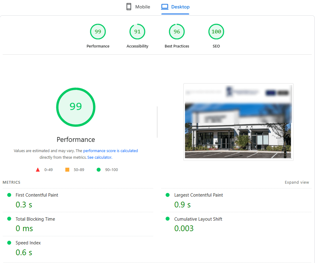
Yes, their performance scores are pushed to the limit. The numbers look great in tools like PageSpeed Insights.
But when I actually try to use some of these websites as a visitor, the experience is often confusing and frustrating.
And this is coming from someone who works in the field and understands how websites are usually structured.
That is not professional bias, and it is not about wanting everything to look the same.
I value variety. Years of work have simply given me a trained eye for what feels clear, intuitive, and trustworthy.
Some business owners focus so much on technical performance and optimization that they forget one simple thing: websites are used by people, not by machines.
My advice is simple. Spend a little time using your own website as if you were a real customer. Even better, ask someone unfamiliar with your business to go through the full journey. Let them search, click, read, hesitate, and try to complete an action. You will quickly see how strong your customer path really is, and where people may drop off.
Of course, not every website has this problem. Many are clear, attractive, and easy to navigate. But there are still plenty of highly optimized websites with confusing user flows and weak structure.
So here is the reminder:
clarity and visual quality are not decoration.
They are part of your sales process. They help build trust, reduce friction, and protect conversions.
Do not build only for search engines. Build for the people who actually need to use your business.