Complex B2B Dashboard Redesign – From Hidden Corners to Clear Product Hierarchy

Last Updated on: 6th November 2024, 11:18 am

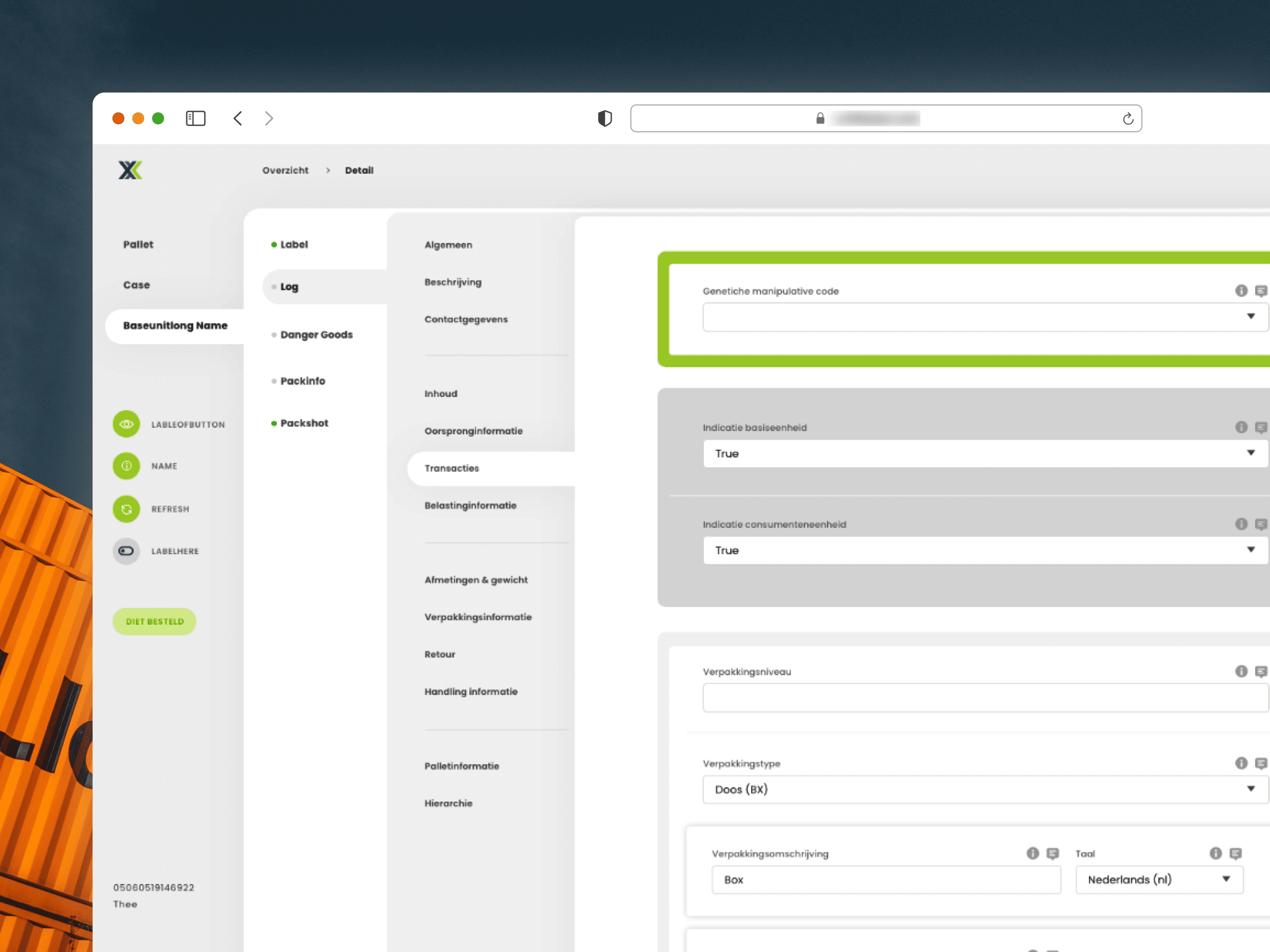
The project involved a complete overhaul of a cluttered B2B dashboard, aiming to improve usability and highlight key features.

After identifying pain points through an audit, we streamlined navigation and implemented a clear product hierarchy.

The redesign, guided by user research and iterative testing, resulted in a 40% increase in product discoverability and a 25% reduction in support requests, delivering a more efficient and intuitive user experience.
Overview

The project focused on redesigning a complex B2B dashboard to streamline the user experience and improve product discoverability. The existing interface suffered from cluttered navigation and hidden features, making it difficult for users to accomplish tasks efficiently. By redefining the information architecture and emphasizing a clear product hierarchy, the redesign aimed to create a more intuitive and user-friendly experience.

Users & Audience

The primary users of the dashboard were corporate clients and enterprise teams who relied on the platform for daily operations, data analysis, and decision-making. These users required quick access to necessary tools and information, with minimal learning curves.

Secondary users included account managers and support staff who assisted clients and needed an efficient system for onboarding and troubleshooting.

Design audit results

The initial UX audit revealed several pain points, including redundant navigation paths, inconsistent design patterns, and a lack of visibility for key features.

User feedback highlighted confusion around product categorization and difficulties in locating essential tools.

Data analysis showed a high drop-off rate in specific workflows, indicating that users struggled to complete tasks without external assistance.

Redesign Process

The redesign process began with user research and workshops to better understand workflows and priorities.

Wireframes and prototypes were developed iteratively, focusing on improving navigation and emphasizing the most-used features.

Testing sessions with end-users ensured that the new design met usability goals.

The final design incorporated a scalable framework, allowing for future product expansions without sacrificing clarity.

Outcome

The redesigned dashboard significantly improved user satisfaction and task efficiency.

Product discoverability increased by 40%, and customer support requests related to navigation dropped by 25%.

The new interface not only simplified complex workflows but also provided a cohesive user experience that aligned with the company’s brand identity, enhancing its value proposition to enterprise clients.