Last Updated on: 25th April 2024, 02:40 pm
Last Updated on: 25th April 2024, 02:40 pm
Description of the organization
The client offers a digital solution for social fundraising and end-to-end aid distribution for humanitarian and development programs. They enable International Non-Governmental Organizations (NGOs), Non-Profit Organizations (NPOs), charities, and governments to distribute tokenized aid vouchers, entitlements, or digital cash directly to the intended end-beneficiaries most transparently and efficiently as possible using the blockchain.
The platform comprises some innovative components. The client’s unique solution ensures full transparency and accountability while optimizing the last-mile distribution process. Private and institutional donors can live-track and observe the impact of their financial contributions in real time.
The audience for a social fundraising and aid distribution platform would include NGOs, Service Providers, Donors, and Beneficiaries.
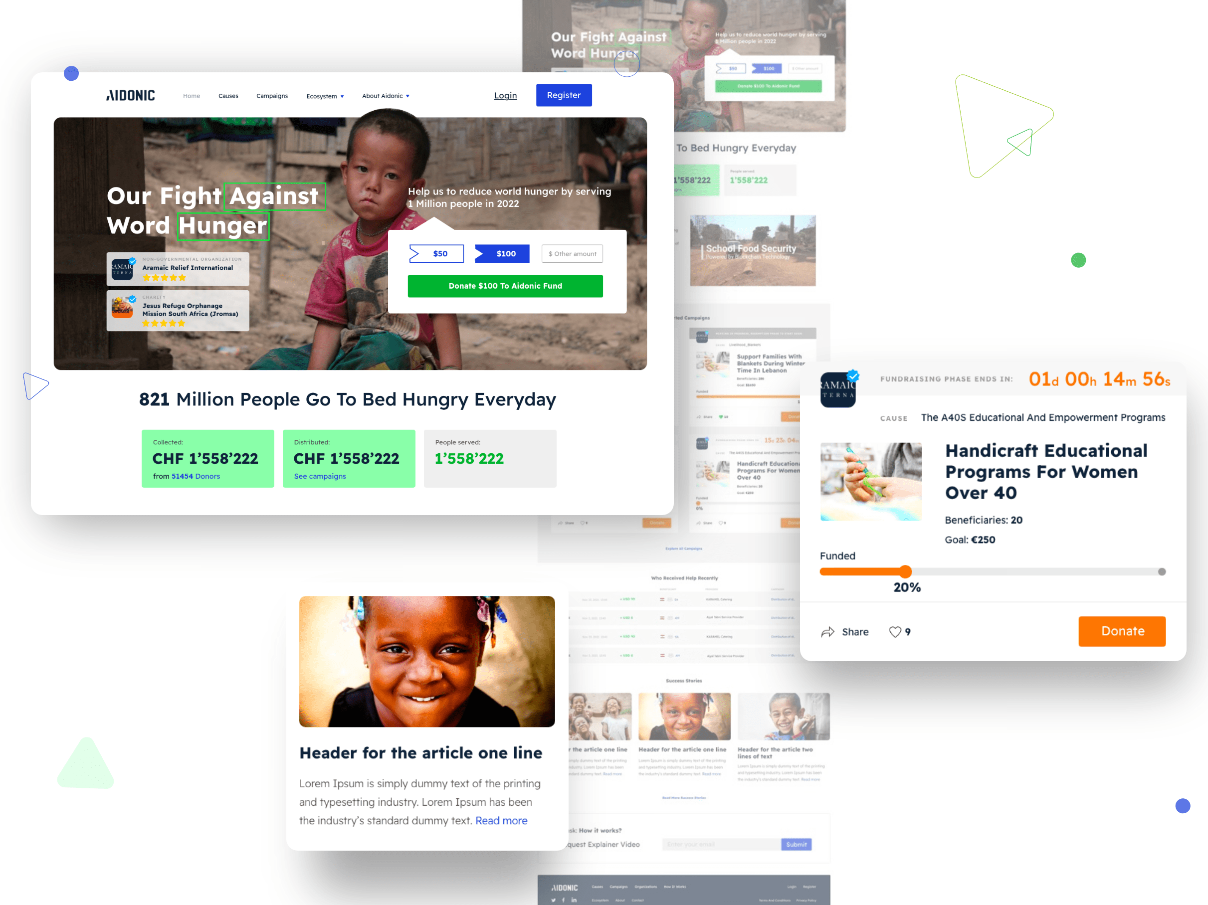
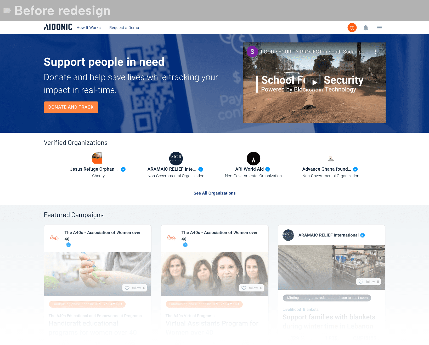
1. Poor Information Architecture: The information architecture of the fundraising platform is poorly organized, making it difficult for users to navigate and find what they need. The lack of a clear hierarchy and labeling of information causes confusion and frustration for users.
2. Outdated Design: The overall design of the platform is outdated and lacks visual appeal. The color scheme is dull and uninviting, and the use of fonts is inconsistent and unprofessional. This contributes to a poor user experience and makes the platform feel untrustworthy.

3. Inefficient Navigation: The navigation system of the platform is not intuitive, making it difficult for users to find what they need quickly. There are too many options and links, making it overwhelming for users to navigate through the site. The search function is also inefficient and often leads to irrelevant results.
4. Lack of Visual Hierarchy: The lack of a clear visual hierarchy makes it difficult for users to prioritize information and understand the relationship between different elements on the platform. This contributes to a cluttered and confusing layout that overwhelms users and discourages engagement.
To improve the user experience and interaction with the fundraising platform, a comprehensive redesign was needed. Addressing issues such as lack of a clear information architecture, inefficient navigation, poor mobile optimization, and lack of visual hierarchy can greatly improve the usability and visual appeal of a platform. A user-centric design approach is critical to ensure that the updated platform meets the needs and expectations of its target audience, ultimately leading to increased donations and donor satisfaction.
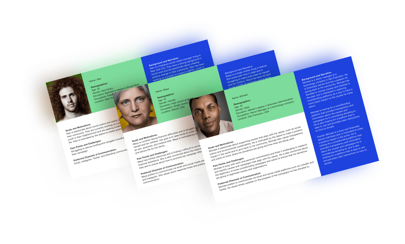
Step 1. Research and Analysis: The first step in the UX redesign process involved conducting research and analysis to gain a deep understanding of the platform’s users, their needs, and their pain points. It was also crucial to analyze the existing platform’s data, user feedback, and industry trends to gain a comprehensive understanding of the platform’s strengths and weaknesses.
Step 2. Define User Personas and User Journeys: Using the insights gathered from research and analysis, the next step was to define user personas and user journeys. This involved creating detailed profiles of the platform’s typical users and mapping out their journeys on the platform, from initial engagement to donation. User personas and journeys served as a guide for the rest of the UX redesign process and helped ensure that the redesigned platform met the needs of its target audience.
Step 3. Ideation and Design: Armed with the insights from research and analysis and the user personas and journeys, the next step was to ideate and design the new interface. This involved sketching wireframes and creating prototypes of the redesigned platform. The design team focused on creating a user-friendly and visually appealing interface that guided users through the donation process efficiently.
Step 4. Testing and Iteration: Once the initial design concepts and prototypes were created, the next step was to test and iterate on the design. This involved conducting user testing to gather feedback on the redesigned platform’s usability, visual appeal, and overall user experience. Based on the user feedback, the design team iterated on the design, making changes and improvements to the platform’s design and functionality.
Step 5. Implementation and Launch: After the design and testing iterations were complete, the final step was to implement the new design and launch the redesigned interface. This involved working with developers to code and implement the new design and conducting final testing to ensure that the platform would be functional and user-friendly. Once the platform will be launched, it becomes crucial to gather user feedback and conduct ongoing testing to ensure that the redesigned platform continues to meet the needs of its users.
A successful UX redesign process for this fundraising platform required a user-centric approach that prioritized the needs and expectations of the platform’s target audience.
Our design team can create a user-friendly and visually appealing interface that guides users through the donation process more efficiently than in the previous version.
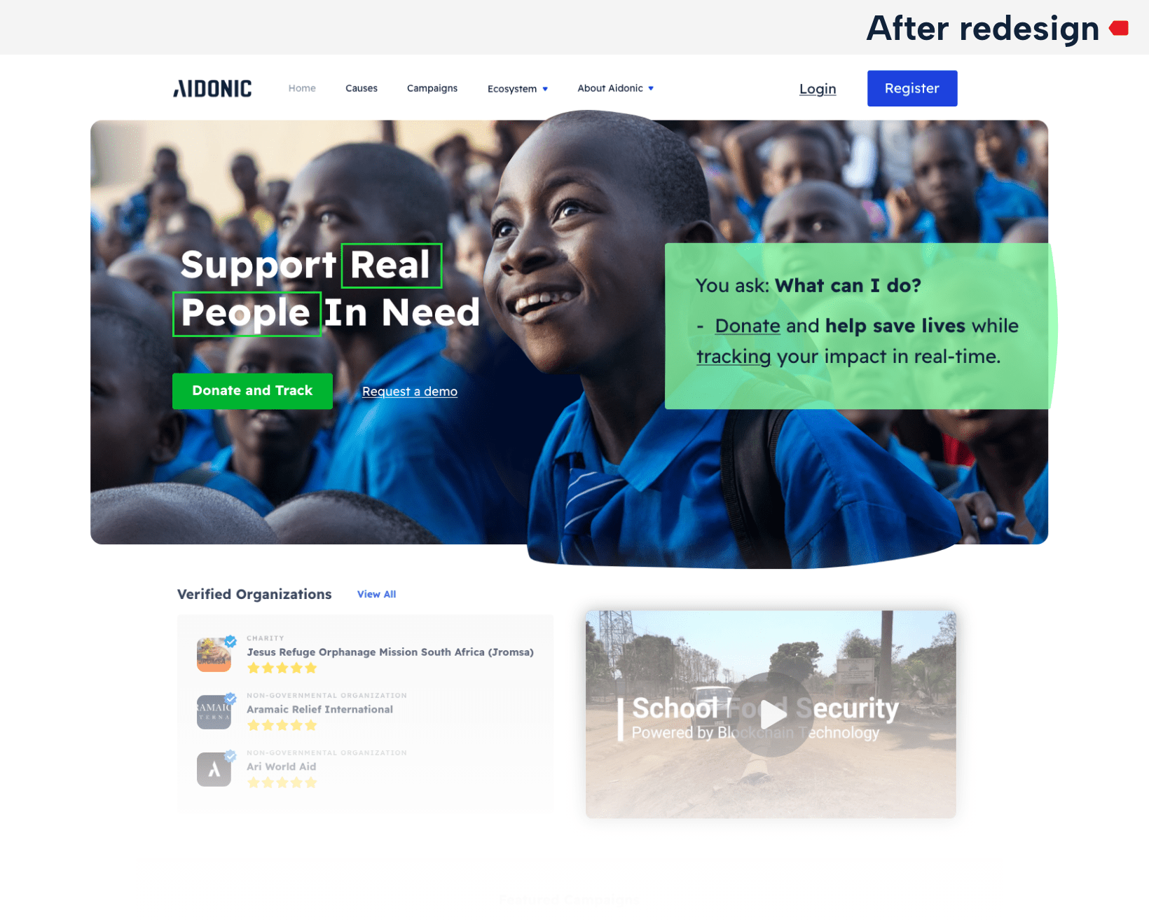
The client was looking for a redesign including better UI/UX of their existing platform. With this redesign, it will be possible to provide their user’s a better experience and a more modern interface. The users should understand immediately what the platform is about and navigate with very short clicks through the platform. Furthermore, owners wanted to have a design that is inviting for all the different user types. They expected and received a modern design approach with a touch of charity/philanthropy.