Last Updated on: 6th November 2024, 11:06 am

Last Updated on: 6th November 2024, 11:06 am

Email service provider (SaaS model, US market) which has several services and panels for various types of clients. And one of their services is a SMTP relay service which allows businesses to send email without using their own servers or domain so that marketing messages can be separated from internal email communications. Email client software provides a graphical interface for users to work with SMTP relay.
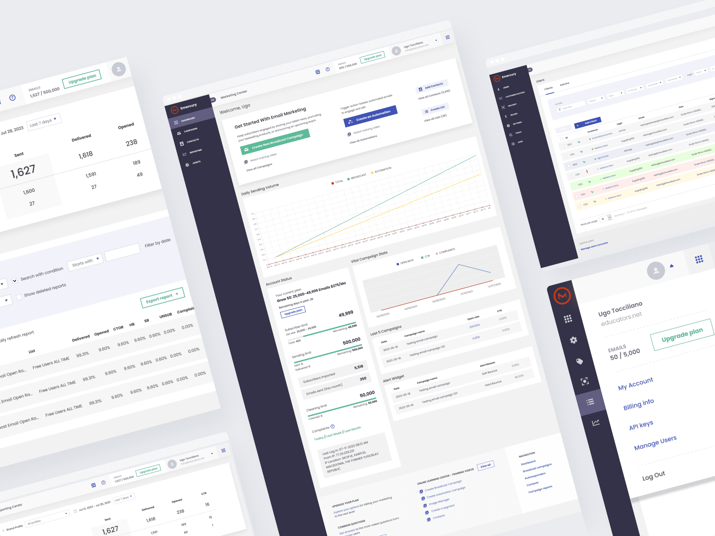
The main problem was to show the clear setup steps to the new customers of the service and provide clear navigation with an easy-manageable tools.
During the “Understand” stage, our first step was to get a list of the existing providers, registered there and gathered all theirs UI strengths and weaknesses (according to specific goals of the users for this type of service) with some screenshots in Miro.
Then we’ve checked the list of the potential clients and created the User Persona for the new service using Miro.
The next step was to create the Navigation and User Flows in MindMeister.
Then we did basic wireframes, discussed them with the stakeholders and moved them to the user testing and got the considerable feedback.
After the necessary changes, we started the hi-fi mockups and moved the interactive prototypes to the user testing again.
And after gathering clear usage data, we’ve provided the final approved mockups to the developers. After that stage, we had a couple of iterations to launch the web app tool.
Now our client has a usable and useful online tool for his customers with a full toolbox of the settings, clear registration process and clear navigation. And this is a main goal of the UX redesign process.