Transform Your Website: Effective UX Redesign and CRO

The intersection of Conversion Rate Optimization (CRO) and User Experience (UX) Design is where the magic happens in achieving a digital presence that attracts visitors and converts them into loyal customers.

We’re convinced at FastRedesign.com that these two areas aren’t just overlapping, they’re actually inseparable, each amplifying the other.

Here’s how we combine UX redesign and CRO to maximize your business’s online potential.

Holistic Approach to User-Centered Design

Basically, any website UX redesign starts off by focusing on the user’s needs, behaviors, and pain points, and this core principle helps us to create intuitive, seamless, and engaging interfaces.

Even the most eye-catching design might not drive conversions without CRO’s analytical insights.

We combine UX design tools with CRO metrics to ensure that our designs are user-friendly and also strategically optimized to lead users to desired actions.

Data-Driven Redesign Decisions

At FastRedesign.com, we take advantage of data at every stage of the redesign process. CRO helps us understand how users interact with your website, what obstacles they face, and which elements drive engagement.

We can make smart design decisions by looking at metrics like session durations and bounce rates. And this data-driven approach always makes sure that every tweak and adjustment is backed by real-life evidence, which makes design solutions much simpler and more effective in any way.

UX redesign and CRO

User Feedback Integration

Both UX redesign and CRO derive benefits from user feedback — our team continuously seek and incorporate user feedback through surveys, usability tests, and direct user interactions.

These qualitative data complement our quantitative analysis and provide a holistic view of user experience.

By understanding why users do what they do, we can make design changes that resonate with your audience.

Design components that work together

To connect UX redesign and CRO, you need to understand how they can be utilized together.

For example, a well-designed landing page with clear and persuasive messaging (a CRO tactic) must also be easy to navigate and visually appealing (a UX design principle).
Things like fast loading speed, intuitive navigation, responsive design, and clear CTAs are all crafted to create a seamless and enjoyable user journey.

Basically, we make sure that our design elements serve two purposes: enhancing the user experience and encouraging users to convert.
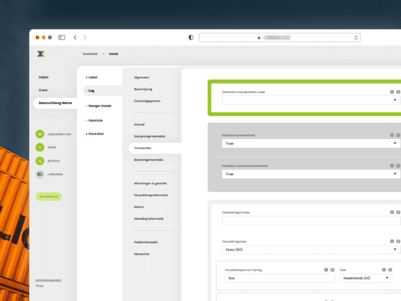
 

UX redesign and CRO


Real-Life Examples and Results

One of our first clients, a wholesale marketplace for industrial goods, experienced an increase in volume of purchase orders from the catalog website after improving navigation.

Only by reducing the number of form fields and implementing trust signals (UX enhancements), and testing different promotional offers and CTA placements (CRO strategies), we were able to achieve a 25% increase in completed purchases.

This case clearly illustrates how integrating UX redesign and CRO leads to measurable, impactful results when combined.

Best Practices for Combining UX redesign and CRO

1. Collaborative Mindset
Foremost, we all have to try to set up a collaborative environment between our designers and your analysts and marketers. With a goal to connect creativity with analytics.

2. Align Goals and Expectations
Next, ensure that UX redesign and CRO work towards common goals. Such as reducing drop-offs and increasing engagement.

3. Use User-Centric Metrics
Focus on metrics that are most important to users, such as task completion rates and satisfaction scores, along with conversion metrics.

4. Holistic User Journey
Look at the entire user journey. From landing on the site to completing a conversion, ensuring each touchpoint is optimized.

5. Iterative Testing
Continuously test and iterate on designs based on data and user feedback to improve the user experience.

* * *

Incorporating UX redesign and CRO appears to be an iterative course of action that calls for both analytical proficiency and design insight.

We at FastRedesign.com are dedicated to creating digital experiences that are not only visually appealing and intuitive, but also highly effective in convincing customers to convert.

Contact us today to learn how we can improve your digital strategy through the powerful combination of UX redesign and CRO.

In UX design, “dark patterns” have become infamous. They’re deceptive design tricks that steer users into undesirable actions, often benefiting the site or app but hurting the user. While they can offer short-term gains, they damage trust and have lasting negative effects. Here, we’ll delve into dark patterns in UX and why redesigning them is crucial for ethical and user-friendly design.

Understanding Dark Patterns in UX design

Dark patterns come in various forms and can be found across websites and apps. Some common examples include:

  1. Misdirection: This involves using visuals or language to direct users toward a particular action, often making it difficult for them to find alternative choices.
  2. Hidden Costs: Concealing or downplaying additional charges during the checkout process, only revealing them at the last moment.
  3. Roach Motel: Making it easy for users to sign up but incredibly difficult to cancel a subscription or account.
  4. Sneak into Basket: Adding items to a user’s shopping cart without their consent, hoping they won’t notice.
  5. Confirmshaming: Guilt-tripping users into taking a particular action, such as signing up for newsletters.


Sears.com: This modal includes a classic example of a manipulink. A prompt, Enter your email to get started is followed by two “creatively” labeled options: Show Me The Deals, and the manipulink, No thanks, I don’t like deals. The text actually stating that users will receive promotional emails is the least noticeable on the page.

Sears.com: This modal includes a classic example of a manipulink. A prompt, Enter your email to get started is followed by two “creatively” labeled options: Show Me The Deals, and the manipulink, No thanks, I don’t like deals. The text actually stating that users will receive promotional emails is the least noticeable on the page. Read full article – By Kate Moran and Kim Salazar


Who uses dark patterns

Dark patterns are used by many, intentionally or not, to meet specific goals, often harming the user’s experience. Some do it knowingly to deceive or manipulate, while others do it unintentionally due to design mistakes. Here are some examples:

  1. E-commerce Websites: Online retailers may use dark patterns to encourage users to make more purchases, sign up for newsletters, or opt for costly add-ons during the checkout process.
  2. Subscription Services: Some subscription-based services may make it challenging for users to cancel their subscriptions or hide important terms and conditions.
  3. Social Media Platforms: Social media platforms may employ dark patterns to increase user engagement, such as by sending frequent notifications, making it difficult to disable certain features, or using persuasive design to keep users scrolling for extended periods.
  4. Email Marketers: Marketers may use confirmshaming techniques in email opt-in forms to guilt users into subscribing to newsletters or promotional emails.
  5. Gaming Apps: Mobile games may use dark patterns to encourage in-app purchases, such as by making it frustratingly difficult to progress in the game without spending money.
  6. Privacy Settings: Some apps and websites may use confusing or misleading language in their privacy settings to get users to share more personal information than they intend.
  7. News Websites: Online news outlets might use misleading headlines, clickbait, or deceptive layouts to drive more clicks and ad revenue.
  8. Financial Services: In the finance sector, dark patterns could be used to hide fees or make it difficult for users to access essential information about their accounts.
  9. Government Websites: Even government websites have been criticized for using dark patterns in the past, such as making it hard to opt-out of data sharing or find critical services.
  10. Startups and Smaller Businesses: Some smaller organizations, in their pursuit of rapid growth, may resort to dark patterns unintentionally, driven by a desire to increase conversion rates and user engagement without fully understanding the ethical implications.

The Problem with Dark Patterns

Dark patterns undermine the principles of ethical design and user-centricity that should be at the core of every UX project. They manipulate users, erode trust, and can even lead to legal repercussions for organizations that employ them. In a digital age where user trust is paramount, dark patterns can do irreparable damage to a brand’s reputation.

Moreover, dark patterns can create a frustrating user experience. Users who feel deceived or forced into actions are unlikely to return to a website or app, resulting in lost potential customers and revenue.

The Ethical Imperative: Redesigning Dark Patterns

Redesigning dark patterns is not only an ethical imperative, but also a smart business decision. Here are some steps to consider when embarking on this essential journey:

1. Educate Design Teams

Begin by educating your design teams about dark patterns and their implications. Ensure that designers understand the importance of ethical design and the long-term consequences of deceptive tactics.

2. Review Existing Designs for Dark Patterns

Conduct a thorough review of your current designs to identify any dark patterns that may exist. This process may require input from both designers and usability experts. Be open to criticism and ready to admit past mistakes.

3. Prioritize User-Centric Design

Shift your design philosophy toward a more user-centric approach. Make it a priority to create designs that empower users to make informed decisions, rather than tricking or coercing them.

4. Test Ethical Alternatives

When redesigning dark patterns, explore alternative design solutions that prioritize transparency, clarity, and user consent. A/B testing can help determine which ethical designs perform best.

5. Gather User Feedback

Involve users in the design process. Collect feedback on new designs and iterate based on their input. Users appreciate when their voices are heard and valued in the development process.

6. Foster a Culture of Ethics

Promote a culture of ethical design within your organization. Encourage discussions about ethical dilemmas and provide guidance on how to make responsible design choices.

The Benefits of Ethical Design

Redesigning dark patterns in UX design not only restores trust but also offers numerous benefits to businesses and organizations:

  1. Enhanced Reputation: Ethical design builds a positive reputation, fostering trust and loyalty among users.
  2. Increased User Engagement: Users are more likely to engage with a website or app when they feel respected and in control.
  3. Long-Term Success: Ethical design practices contribute to long-term success by nurturing lasting relationships with users.
  4. Legal Compliance: Avoid the legal risks associated with deceptive design practices.
  5. User-Centered Innovation: Ethical design encourages innovation that genuinely benefits users, driving organic growth.

Conclusion

Redesigning dark patterns in UX design is not just a trend; it’s a moral imperative. Ethical design not only benefits users but also strengthens brands and organizations in the long run. By prioritizing transparency, trust, and user empowerment, businesses can create a brighter, more user-friendly digital future. Embrace ethical design practices, and you’ll find that it’s not only the right thing to do—it’s also the smart thing to do.

A Guide to Accessibility Testing Resources

In our digital era, web accessibility isn’t just good practice; it’s often a legal requirement. Accessibility testing helps remove digital barriers, ensuring that people with disabilities can fully engage online. As our lives depend more on digital interactions, accessibility becomes a necessity, ensuring that everyone can use websites and apps with ease.

In this article, we’ll explore a treasure trove of resources aimed at helping developers, designers, and testers make their digital offerings more inclusive.

Understanding Accessibility Testing

Before diving into these valuable resources, let’s grasp the essence of accessibility testing. At its core, accessibility testing assesses digital content’s usability for individuals with disabilities, including those with visual, auditory, cognitive, or motor impairments. The goal is to guarantee that everyone, regardless of their abilities, can access, interact with, and comprehend digital content effectively.

1. Web Content Accessibility Guidelines (WCAG)

The bedrock of web accessibility is the Web Content Accessibility Guidelines (WCAG). Crafted by the World Wide Web Consortium (W3C), WCAG presents an exhaustive set of principles and success criteria for enhancing web content’s accessibility. These guidelines revolve around four key principles: Perceivable, Operable, Understandable, and Robust, collectively known as the POUR principles.

Anyone involved in web development and testing should consider perusing the official WCAG documentation.

2. Automated Testing Tools

Numerous automated testing tools can expedite the identification of common accessibility issues in your digital content. These tools scan websites and applications for problems such as missing alternative text for images and inadequate keyboard navigation. Some popular choices include:

  • WAVE: A free web accessibility evaluation tool by WebAIM, offering detailed reports and visual feedback.
  • axecore: An open-source accessibility testing engine that seamlessly integrates with various development environments and browsers.
  • Pa11y: An automated accessibility testing tool that can be used as a command-line tool, desktop application, or integrated into your CI/CD pipeline.

3. Manual Testing Resources, Web Disability Simulators

Although automated tools are essential, don’t underestimate the importance of good old manual testing in accessibility checks. Manual testing lets you dig deep into things like how content is organized, whether colors are easy to read, if keyboard navigation is smooth, and if screen readers work as they should. When it comes to manual testing, here are some handy resources:

  • Screen Readers: Familiarize yourself with well-known screen readers such as JAWS, NVDA, and VoiceOver, each possessing unique features and behaviors.
  • Motor Impairment Simulators. Keyboard Shortcuts and Voice Commands: disabling the mouse and using only keyboard shortcuts or voice commands can simulate motor impairments, helping identify navigation and interaction challenges.
  • Color Contrast Checkers: Utilize tools like the WebAIM Color Contrast Checker to verify text readability for users with visual impairments.

Color Blindness Simulators:

  • Colorblind (Chrome extension) helps users experience websites as if they have different types of color blindness.
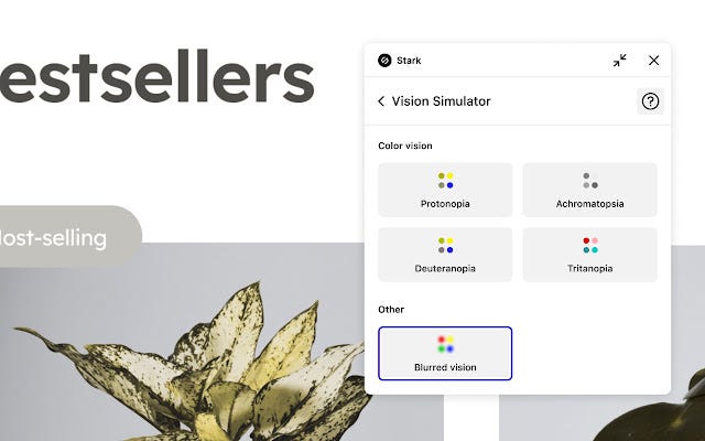
  • Stark Accessibility Checker (Chrome extension) — find and fix compliance issues in record time with automated checks and smart suggestions.
  • Sim Daltonism (macOS app) simulates various types of color blindness. It allows designers and developers to check their designs for color accessibility.

4. Interactive Learning Platforms

Several platforms offer interactive courses and tutorials to help individuals and teams bolster their accessibility knowledge and skills:

  • WebAIM Training: Delivering online training courses and webinars on various web accessibility topics.
  • Coursera, edX, Udemy: These platforms host accessibility-related courses offered by professionals, universities and organizations worldwide.

5. Accessibility Communities and Forums

Engaging with the accessibility community proves incredibly advantageous. Online forums and communities offer spaces to seek guidance, share experiences, and stay updated on the latest developments:

  • WebAIM Community: A forum for discussions on web accessibility, WCAG, and related subjects.
  • A11y Project: A community-driven initiative dedicated to simplifying web accessibility.
  • Stack Overflow: Featuring an active accessibility tag where developers can seek assistance and offer insights on accessibility-related issues.

6. Accessibility Testing Plugins

For developers and testers leveraging content management systems (CMS) like WordPress, Drupal, or Joomla, accessibility testing plugins are invaluable. These plugins facilitate the identification and resolution of issues within your CMS:

  • WP Accessibility: A WordPress plugin that introduces various accessibility enhancements to your website.

7. Government Resources

Numerous governments furnish guidelines and resources for digital accessibility. These resources offer valuable insights into legal requirements and best practices:

  • Section508.gov (USA): An information hub detailing Section 508 requirements and accessibility standards for federal agencies.
  • Gov.uk (UK): Offering guidance on digital accessibility compliance for UK government websites.

8. Accessibility Testing Labs

For organizations aiming to go the extra mile, specialized accessibility testing labs are at your service. These labs conduct comprehensive testing and consultancy services, delivering expert insights to ensure your digital products meet the highest accessibility standards.

Prioritizing Accessibility in the Redesign Process

When embarking on the redesign of digital properties — be it websites, applications, or online platforms — prioritizing accessibility from the outset is paramount. In Fastredesign we know: that accessibility should never be an afterthought; it should be woven into the very fabric of design and development.

Designing with accessibility in mind ensures inclusivity from the get-go, benefiting a diverse user base, including those with disabilities. This approach not only ensures compliance with legal requirements but also enhances an organization’s reputation for social responsibility and inclusiveness.

Moreover, addressing accessibility during the redesign phase is often more cost-effective and efficient than attempting retroactive accessibility fixes on an existing system. By making accessibility a top priority in the redesign process, we create a digital world that is more equitable and accessible for everyone.

In conclusion, accessibility testing is not a one-time task but an ongoing commitment to inclusivity. By leveraging the vast array of resources available, from guidelines like WCAG to automated tools, interactive courses, and community support, you can make significant strides in creating a digital landscape that is accessible to all.

Remember, accessibility is not just about compliance; it’s about providing equal opportunities and a better experience for everyone.

Empower your digital spaces with accessibility, and you’ll be enriching the lives of countless individuals while embracing the principles of universal inclusivity.