


Last Updated on: 1st December 2023, 02:08 pm
Simple Guide How to Audit Your Site on Your Own
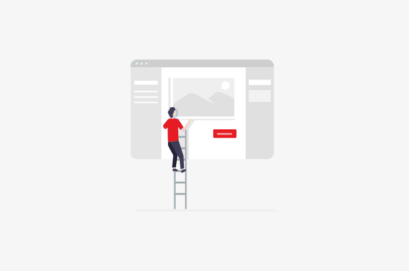
If your business is not very large and you handle yourself (with the help of a freelance team) with the tasks responsible for your projects’ performance and profitability, this information will be useful to you as a guide to a web product self-analysis.
And so we found out that YOU are personally responsible for your business, and you do not have managers and full support and development teams on the staff who monitor your site 24/7, maintaining and improving its position.
Therefore, I will list only the work that YOU as an owner can carry out on your own, and the identified problems can either be solved by yourself or transferred to a freelance team to eliminate them.
Start testing your site with common site analysis tools such as:
- Collection of site statistics: Google Analytics
- Is your page mobile optimized? Try Google Mobile-Friendly Test
- Google PageSpeed Insights – Learn how to make your site load faster on any device
- Google Search Console – Site rating score
- Readable – Accessibility check
- Originality – Plagiarism checking and AI detection tool
- Website Grader – A tool for drawing up a report card on how well your site is performing
- Yoast SEO (when using CMS WordPress)
- Measure / Web.dev – See how well your website performs
- GTmetrix – How fast does your website load?
All these tools will provide you with a general understanding of the processes taking place on your resource.
The following guidelines will help YOU evaluate the home page’s design and conduct a cursory analysis of usability.
Since creating a website is a complex technical process that consists of many hours of work of specialists from different fields, you will only check some of the design criteria that will closely match the web design rules. If YOU need a professional UX / UI audit with a comprehensive solution to any problems and further support your product, you need to contact FastRedesign.
Make it clear to the user what you offer.
The first thing to pay attention to is whether the user can quickly understand what your page is talking about and what it offers him. To form his first opinion about the site, the user will need 2.6 seconds.
Further, according to MarketingExperiments, it will take a visitor of your site about 7 seconds to understand whether it is worth further studying the information of your resource or leaving it. Thus, all the work done on your site depends on the content’s correctness, and to this point should give this special attention.
You can ask people unfamiliar with your site, relatives, or friends to try to understand what you offer the user on your page. Hear their interpretation of what they saw on your site. Using the information received from them, you can improve your page’s content and usability, making it more accessible to users.
Advertising blocks
If you have pop-up ad units on your page, YOU must choose between a good relationship with your site’s users and ad revenue.
When entering the page, a pop-up overlaps the main content, making the user only one desire to either collapse this pop-up or immediately leave the page.
Also, ad units placed in your site’s sidebars will cause negative emotions in the user, distracting him from searching for necessary information. Therefore, check if there is any extra information on your page that YOU could refuse.

Site navigation
Check all the links on your site to see if they go to the right places. Remove the incorrect links if they are not needed or correct them to the correct link addresses. Ninety percent of sites have a “navigation menu,” and chances are your site has a navigation menu. It also needs to be checked for correct transitions. To do this, YOU should draw a menu navigation diagram, especially if there is “deep nesting,” as in the example below.
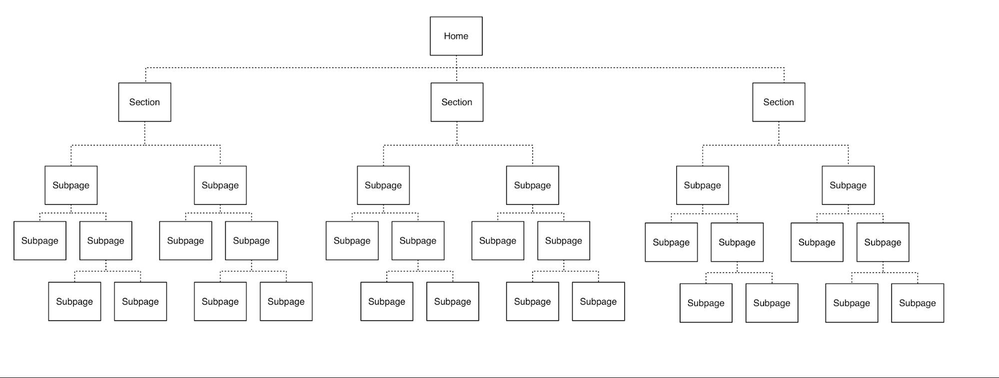
So it will be easier for YOU to present the entire transition scheme as a whole and correct the deviations found. Check if there are links to all main pages.
When doing Self UI Audit, You also need to adhere to the rule that there should be no more than five items on the menu, so try to make them as informative as possible. The menu items should be sorted in order of importance, from most important to secondary.
Check if the user can contact you, if necessary. The menu should be located in a visible and familiar place for the user, and there is no need to transfer it to the sidebar or hide it from the user (experienced creative studios can afford this).
Call to actions
If your resource has a button(s) with a “call to action,” just like in the example with links, you need to check the correct transition from the button to the required resource.
A “call to action” must be precisely formulated and understandable to the user, do not allow ambiguous calls. (Check out these examples). Check the position of the button. It should be in the most visible to the user place, standing out in a contrasting color against the background of the page.
“Readability” of the text
For users to quickly and comfortably understand your site, you must use a large font. It is No need to make huge fonts, which is also bad for perception. For blocks with text, 14-16px is enough. Use contrast, do not force the user to stare and strain their eyes. Use more space and line space is essential when there is a lot of text on the page. It will make it easier to read. Line spacing should be 120%. If the font size is 15px, then the line spacing should be within 18px.
Observe the visual hierarchy – this will allow the user to understand the structure of the document accurately. Headings are usually 180%-200% of the main font size, subheading 130%-150% of the primary body font size. Do not forget about the indents between paragraphs. As a rule, they should be equal to the size of the main text.
These few rules will not take YOU much time, but it will noticeably change your site for the better if you follow them.
Self UI audit – Wrapping It Up
Alright, that’s a wrap on our dive into self UI audit! Pretty cool stuff, right? It’s like being a detective in your own digital world, poking around, asking questions like, “Does this color vibe with our users?” or “Is this button as click-friendly as it can be?”
This isn’t just about making things look pretty; it’s about getting real cozy with what works and what doesn’t for the folks using your site or app. And hey, it’s okay to pat yourself on the back for the good parts and chuckle at the not-so-good ones.
The best part? You get to tweak, nudge, and sometimes overhaul things until they’re just right. It’s a journey, not a one-time deal, and it’s all about making your digital space a delightful place for your users.
So, keep those eyes peeled, stay curious, and let’s make some awesome user experiences! And don’t hesitate to contact us if you need help on this journey.